My cooperation with Culturas began in Fall 2015. I was to design a new logo for the club, one which exuded a purely Latino/Hispanic air - a feat that wasn't as simple as it sounded. Before doing any design work, I had to do research. My main goal at the time was to avoid stereotypes, and instead encompass Latino and Hispanic in the global sense. Probably the most important thing I learned was that Latino and Hispanic don't mean the same thing. Hispanic covers Spanish-speaking countries, while Latino covers those from Central or South America. Therefore, I had to create a logo that didn't strictly conform to either of these things. Aztec motifs were off the table. Tacos, cacti, and Incan patterns were an absolute no. Eventually, I decided to go for something that banked on the concept of inclusivity. Thus, the hand symbol was born.
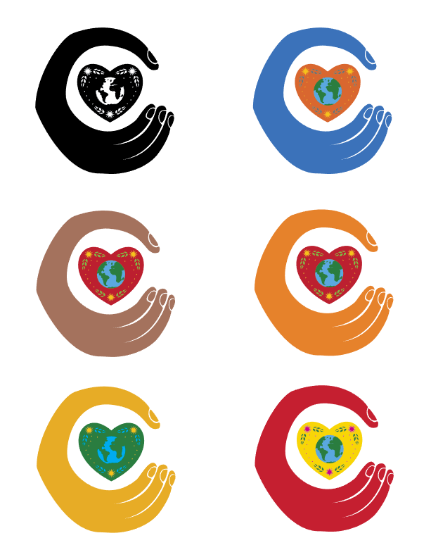
Initial logo design, based on a hand and Hispanic/Latino folk art.
Eventually, I also thought about things that both Latino and Hispanic culture had in common. Then, it came to me: the guitar. The guitar is probably the most prevalent instrument in the music of both cultures. I ended up deciding on morphing the club's name into the shape of a guitar.
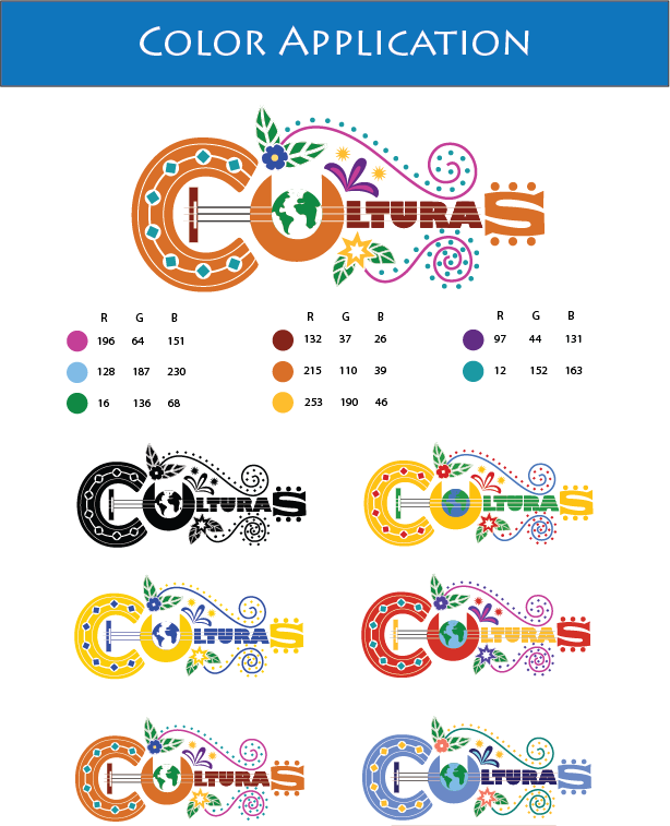
Color experimentations with the guitar-shaped design.
After experimenting with color, I settled for a color scheme that was primarily warm, with only a few cooler colors thrown in between. It was a hit with the client.
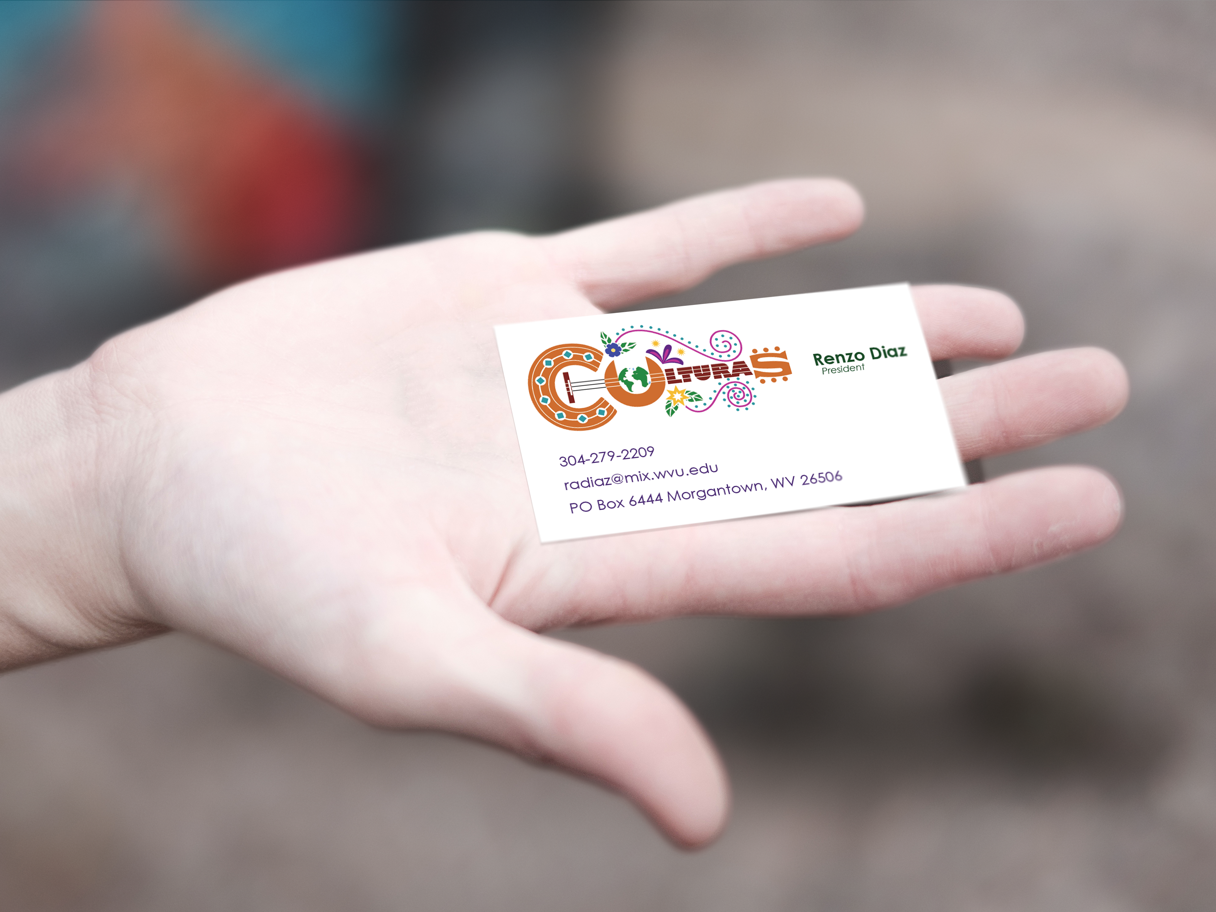
Here's an example of the logo in use on a business card.