[Copy for this page was composed in plain text using TextEdit on a Mac (Windows Notepad equivalent) then pasted into the eCampus text editor and formatted there. All images were preloaded into the Content Collection and added to the page in the text editor after formatting. CSS Tool was used to create space around images and to add line height of 145% in paragraphs. Primary Font: Georgia, 4(14pt); Header is size 6(24pt); Sub Header 1 is size 5(18pt). HTML code examples: Courier New 4(14pt); h1 example positioning is centered; p example positioning is Blockquote. Red text is #CC0000 also known as Boston University Red.]
Many academics have a fondness for Times New Roman, and for printed material, it's great. However, people with some visual and cognitive disabilities like dyslexia may have some difficulty with it when reading online. Two fonts that were developed specifically to render well on computer screens are Georgia (a serif font) and Verdana (a sans serif font). WVU University Relations prefers Helvetica Neue (pronouced 'noya') for sans serif text, but regular Helvetica is considered an acceptable second.
This page uses Georgia. (Complete formatting details are indicated at the top of the page).
Every course management system has its own peculiarities when it comes to creating text. We'll use the eCampus text editor to create narrative pages. It pays to get familiar with it.
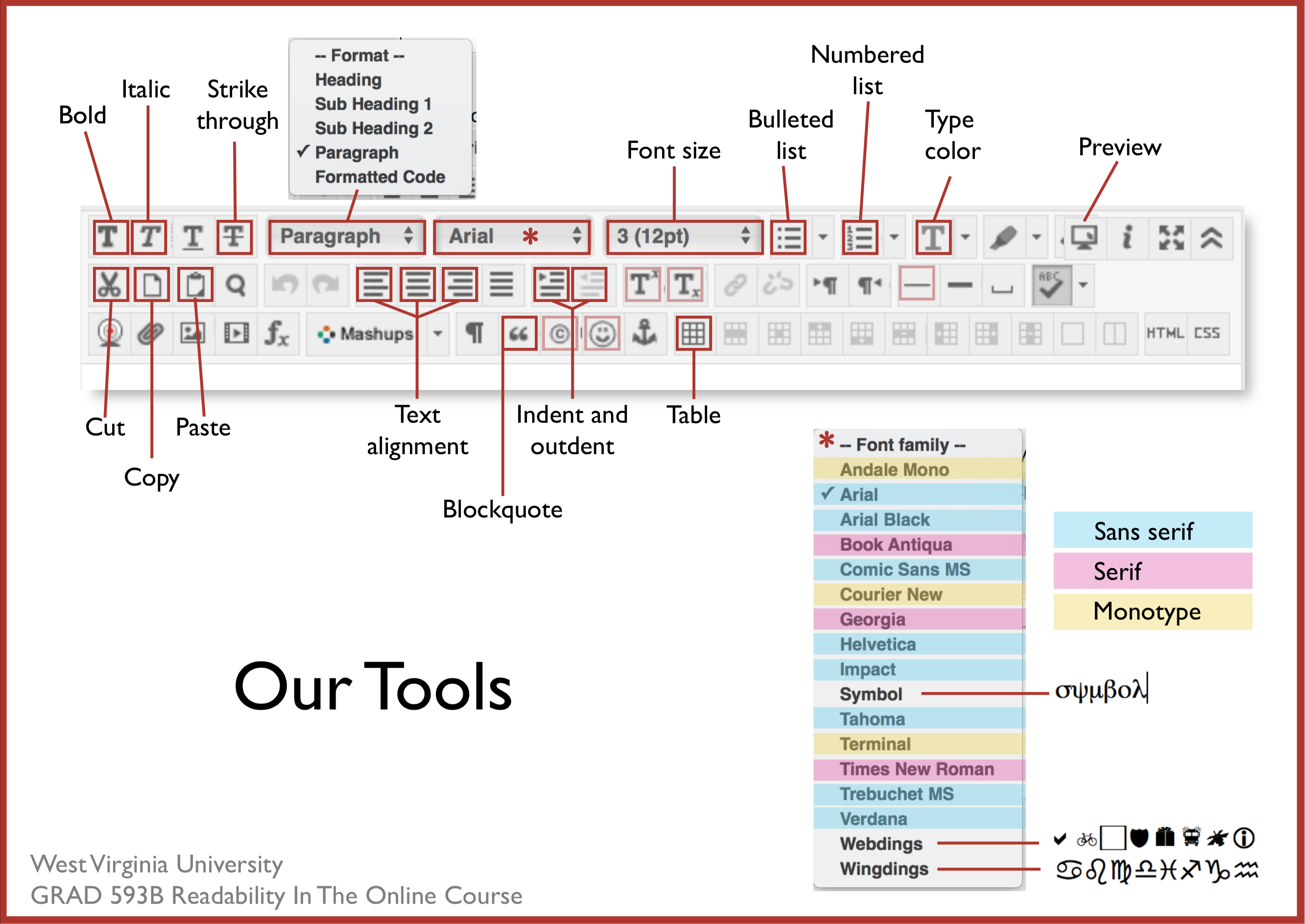
In the image below, I have indicated (red boxes) the tools you will likely use the most to format text. I'm sure they're familiar to you. Nearly every word processing app (MS Word, etc.) uses the same kind of tools. You'll notice that some of the tools are highlighted with a pink box, rather than red. Those tools are not as commonly used (although they could be).
Notice that of the sans serif fonts used most often, Verdana and Trebuchet MS are the only two fonts in eCampus that distinguish clearly between a lower case l and an upper case I.
Arial – Illinois is number 1.
Helvetica – Illinois is number 1.
Tahoma – Illinois is number 1.
Trebuchet MS – Illinois is number 1.
Verdana - Illinois is number 1.
Page hierarchy is both visual and structural. Your sighted students will appreciate the visual hierarchy and your visually impaired students need the structural hierarchy. It lets your readers know the level of importance of the elements on your page.
The formatting tools in eCampus will help you do this structurally (in the code). Look at the image of our tools (above). The Paragraph dropdown menu contains the major formatting elements — headings and paragraphs.
Blockquotes, lists, and horizontal lines are other structural and visual options that will affect the reader's attention. And the size and color tools will provide additional visual options.
* IMPORTANT!
Even if the type in the default heading looks just the same as bold text, DO NOT replace one with the other. This is an accessibility issue. When you use the Header choice from the text editor menu, it is identified as a header in the code so that visually impaired readers using screen readers (like JAWS) will know it is a header and not simply emphasized text within a paragraph.
Behind any web page you see, a header is coded like this:
<h1>Header Level 1</h1>
(We have 6 possible levels of headers. Your text editor uses only levels h4, h5, and h6 because the first 3 are already taken by the eCampus framework your page is a part of).
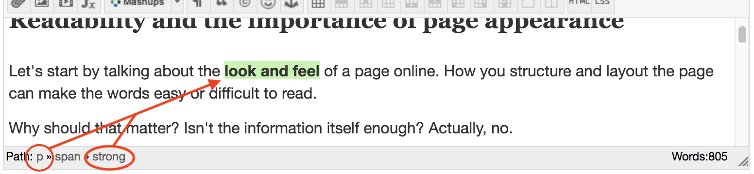
<p>A paragraph is coded like this, and the one bold word will be coded like <strong>this</strong></p>
You never see this when you read a page (unless something is very wrong). And though you may see the headings and the spacing between the paragraphs, a visually impaired students cannot and must rely on the screen reader to tell them. So use the proper tool for the intended element in the display. (You would be wise to apply this guideline to any Word documents you create, too, by using the Styles Pane in that application. Here's a demo FYI).
Look at the bottom of the text editor and you'll see a "Path" indicated.

Note: Headings MUST follow a sequence on the page — Header then Sub Header 1 then Sub Header 2.
Do not use a Sub Header without or before a Header.
Stick with familiar fonts. Make sure they are sized large enough to read easily. Here are how sizes differ from one typeface to another. All the following are set to be 3(12pt), the default here in the eCampus text editor.
Now see what they look like at 4(16pt).
[I can't take credit for these clever pangrams. I confess, Googled them.]
Serif fonts are those with little wings or lines that flare out from the ends of the letters. (Shown in red). You may hear this category referred to as Roman type.


![]() Sans Serif fonts (pictured right) are those without the little flared embellishments. Sometimes this category is called Gothic type.
Sans Serif fonts (pictured right) are those without the little flared embellishments. Sometimes this category is called Gothic type.
Fonts in the Monospace group can be either Serif or Sans Serif in appearance, but they are different from the others on the eCampus list because of the way the letters are spaced. Monospace fonts mimic the spacing that was standard on typewriters. Each letter gets the same amount of space no matter how wide or narrow it is. So the letter “i” is allowed the same width of space as the letter “m”. You may hear this kind of type also called “fixed-pitch” and “fixed-width”.

All the other fonts identified here as either Serif or Sans Serif are proportional. That is, each letter gets just enough space to separate it from the next one. It has always been the preferred type of print publishers and now is the preferred (and default) type on digital devices.
Usually monospaced fonts are used to distinguish computer code from the rest of the narrative or to delineate something that is old-fashioned.