Color can be an effective tool in communicating online. Color can be extremely annoying and counter-productive as well. Getting too "creative" with color can really sabotage your readability efforts. Think you could stand looking at a whole page like this?
Color can be an effective tool in communicating online. Color can also be extremely annoying and counter-productive as well. Getting too "creative" with color can really sabotage your readability efforts. Think you could stand looking at a whole page like this?
This?
Color can be an effective tool in communicating online. Color can also be extremely annoying and counter-productive as well. Getting too "creative" with color can really sabotage your readability efforts. Think you could stand looking at a whole page like this?
Or this?
Color can be an effective tool in communicating online. Color can also be extremely annoying and counter-productive as well. Getting too "creative" with color can really sabotage your readability efforts. Think you could stand looking at a whole page like this?
Not likely.
Black text on a white background is much more comfortable to read. Though the reverse can also be true (i.e. white text on a black background) the dark on light is universally accepted practice. (If you've ever used the Kindle app on your tablet or phone, you may have played with these alternative views.)
Contrast is critical
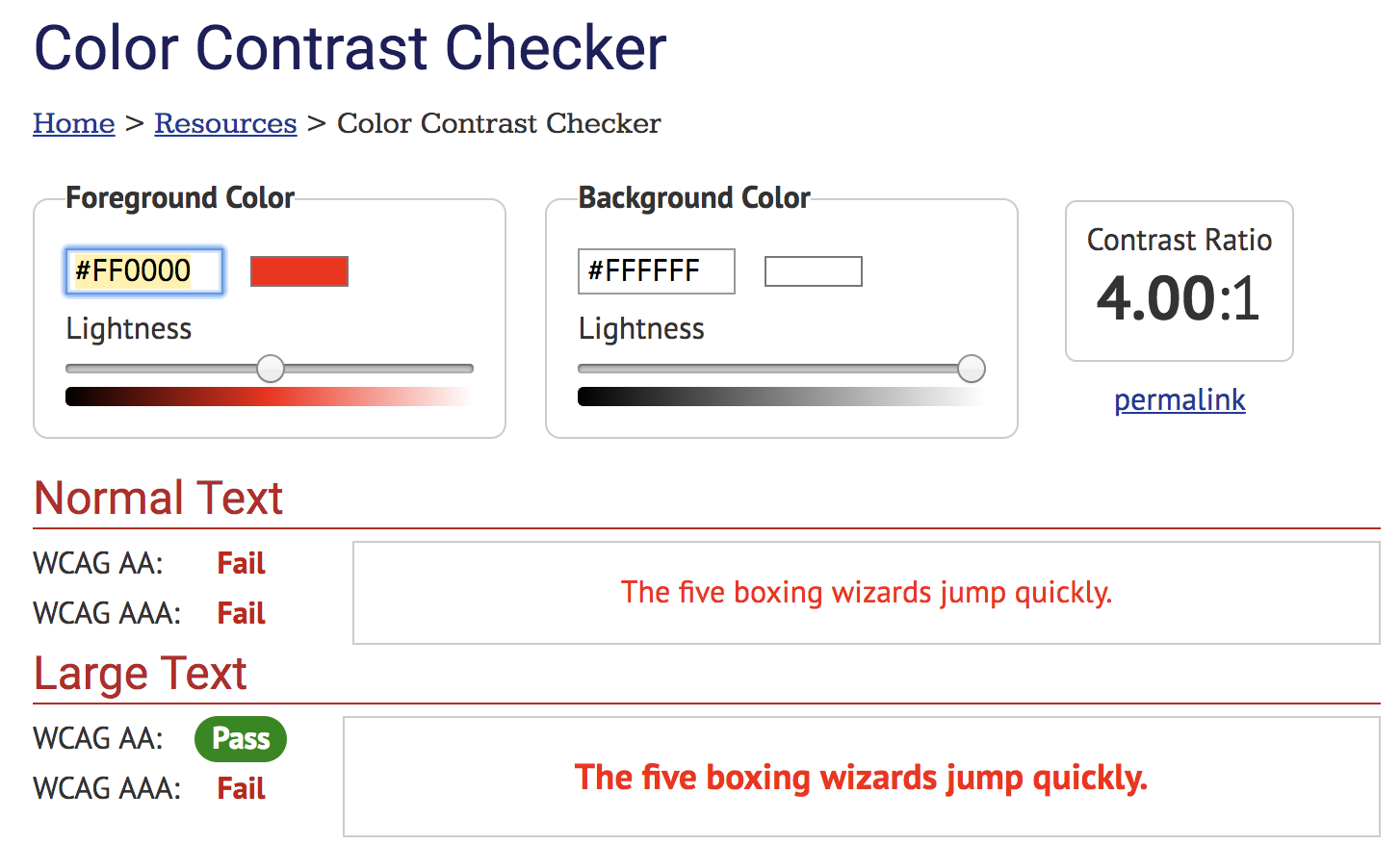
Many color blind folks (estimated 5% of the population) cannot distinguish various parts of the spectrum. Web Content Accessibility Guidelines (WCAG) 2.0 has two standards for normal text and two standards for large text.
Enter #FF0000 (zero, not the letter O) into the Foreground Color text box for the Color Contrast Checker on that page and hit Enter on your keyboard. This is the same red you have when you select that color from the Text color tool on our eCampus text editor. The hashtag followed by six letters and numbers is an HTML hexidecimal (hex) code.
Does it pass the contrast test?
Move the slider for Foreground Color slowly to the left, toward the black end.
Stop when the color 'passes' the WCAG AA requirements for both Normal and Large text.
The hex code that shows up in the text box now has enough contrast to be accessible for most of the people who cannot perceive the color red. Write down that number so you can use it as your go-to red if you need to use it. Move the slider a little more, and stop when all four categories pass. That will be the optimal red to use.
To apply this new red hex code to your eCampus page
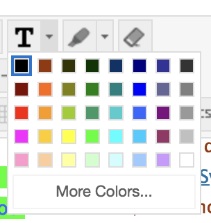
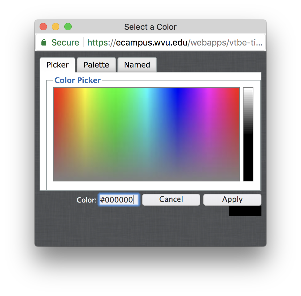
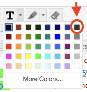
Highlight the text you want to change and go to the Text color tool on the editor toolbar. Then select 'More Colors...'
At the bottom of the window, you'll see a text box for a Color hex code. Enter your new red hex code there and click the 'Apply' button.
Other Accessibility requirements related to color
Color alternatives
If you need use color, make sure that color is not the only way you show meaning.
For example, if you need to color-code items in a table, and you want to use red, blue, and green. In addition to color, you might...
make the items that are red also bold;
make the items that are blue also italic;
and make the items that are green a different font.
That way a student will be able to see the distinctions without having to perceive color.
How black is black?
Many dyslexics experience text distortions when the contrast between text and background color is too high as well as too low. Since estimates of people with dyslexia in the U.S. ranges from 10-17% they are also a significant percentage of our students.
This text on this page is the default black #000000 with default white #FFFFFF background.
We can't change the background color easily here, but we can do something about the text. Evaluate for yourself the the following examples using alternative blacks.
Example 1 - #141414 - gray8
Aliquam lectus orci, adipiscing et, sodales ac, feugiat non, lacus. Ut dictum velit nec est. Quisque posuere, purus sit amet malesuada blandit, sapien sapien auctor arcu, sed pulvinar felis mi sollicitudin tortor. Maecenas volutpat, nisl et dignissim pharetra, urna lectus ultrices est, vel pretium pede turpis id velit. Aliquam sagittis magna in felis egestas rutrum. Proin wisi libero, vestibulum eget, pulvinar nec, suscipit ut, mi. Integer in arcu ultricies leo dapibus ultricies. Sed rhoncus lobortis dolor. Suspendisse dolor.
Example 2 - #0F0F0F - gray6
Aliquam lectus orci, adipiscing et, sodales ac, feugiat non, lacus. Ut dictum velit nec est. Quisque posuere, purus sit amet malesuada blandit, sapien sapien auctor arcu, sed pulvinar felis mi sollicitudin tortor. Maecenas volutpat, nisl et dignissim pharetra, urna lectus ultrices est, vel pretium pede turpis id velit. Aliquam sagittis magna in felis egestas rutrum. Proin wisi libero, vestibulum eget, pulvinar nec, suscipit ut, mi. Integer in arcu ultricies leo dapibus ultricies. Sed rhoncus lobortis dolor. Suspendisse dolor.
Example 3 - #0D0D0D - gray5
Aliquam lectus orci, adipiscing et, sodales ac, feugiat non, lacus. Ut dictum velit nec est. Quisque posuere, purus sit amet malesuada blandit, sapien sapien auctor arcu, sed pulvinar felis mi sollicitudin tortor. Maecenas volutpat, nisl et dignissim pharetra, urna lectus ultrices est, vel pretium pede turpis id velit. Aliquam sagittis magna in felis egestas rutrum. Proin wisi libero, vestibulum eget, pulvinar nec, suscipit ut, mi. Integer in arcu ultricies leo dapibus ultricies. Sed rhoncus lobortis dolor. Suspendisse dolor.
Example 4 - #333333 - gray20*
Aliquam lectus orci, adipiscing et, sodales ac, feugiat non, lacus. Ut dictum velit nec est. Quisque posuere, purus sit amet malesuada blandit, sapien sapien auctor arcu, sed pulvinar felis mi sollicitudin tortor. Maecenas volutpat, nisl et dignissim pharetra, urna lectus ultrices est, vel pretium pede turpis id velit. Aliquam sagittis magna in felis egestas rutrum. Proin wisi libero, vestibulum eget, pulvinar nec, suscipit ut, mi. Integer in arcu ultricies leo dapibus ultricies. Sed rhoncus lobortis dolor. Suspendisse dolor.
The differences are subtle, but significant — even for those without a disability. All of these alternatives can help reduce eye fatigue for just about everyone.
 Enter #FF0000 (zero, not the letter O) into the Foreground Color text box for the Color Contrast Checker on that page and hit Enter on your keyboard. This is the same red you have when you select that color from the Text color tool on our eCampus text editor. The hashtag followed by six letters and numbers is an HTML hexidecimal (hex) code.