What we know so far...
(Source: https://www.nngroup.com/articles/f-shaped-pattern-reading-web-content-discovered/ by Jakob Nielsen on April 17, 2006).
So how do we deal with this?
Consider the whole page layout. That means all the visual elements on a page — areas with text like paragraphs, as well as pictures and diagrams. The area around those elements is...
White space might be empty space, but it is not wasted space. It's a powerful tool to focus the reader's attention. You can apply white space on a page in eCampus with:
...on the page in the first two paragraphs,
...in the heading in the first two words,
...in the paragraph in the first two words, and
...in bullet points in the first two words.
Less is more when it comes to emphasis formatting. Limit it to single words or short phrases. What stands out gets noticed. So don't bold a whole paragraph.
Make bold your first choice.
Use italics for more subtle emphasis, and use it sparingly because people with visual diabilities can have a hard time reading it.
Use color for emphasis sparingly and only as a last option.
Size might also be used for emphasis in certain situations. Big things tend to get noticed before small things.
NEVER use underlines for emphasis — only for links. (Yes, I intended to raise my voice there.)
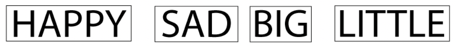
Use them sparingly, too. Capital letters are hard to read (in addition to indicating shouting online). Here's why...
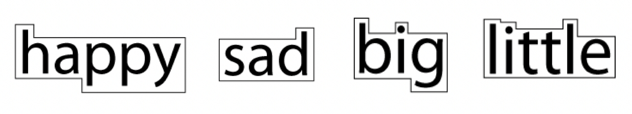
Our brains recognize words by shape as well as by letters.

Lower case letters give the reader recognizable shapes. You can probably make out the words behind the black shapes here even before you see the words.
Now look at the same words in all caps — no distinct shapes to give the reader's brain a hint.

![]() Left-justify (flush left, ragged right) - This is your default option and is the easiest for Western cultures to read. The reader's eye automatically returns to the left side of a page upon finishing a line of text. Anything else can interrupt the flow of thought.
Left-justify (flush left, ragged right) - This is your default option and is the easiest for Western cultures to read. The reader's eye automatically returns to the left side of a page upon finishing a line of text. Anything else can interrupt the flow of thought.
![]() Center (ragged left and right) - Centering might have some usefulness, but only in very rare cases. Not even headings should be centered. Heading default is left-justified for a reason.
Center (ragged left and right) - Centering might have some usefulness, but only in very rare cases. Not even headings should be centered. Heading default is left-justified for a reason.
![]() Right-justify (ragged left, flush right) - Use only if you're writing course material in Hebrew or Arabic. Otherwise, avoid it. Text justified right is very difficult for Westerners to read.
Right-justify (ragged left, flush right) - Use only if you're writing course material in Hebrew or Arabic. Otherwise, avoid it. Text justified right is very difficult for Westerners to read.
![]() Justify (flush both left and right) - Don't be tempted to use this one for online text. It does some strange things to letter- and word-spacing on a line which can distract the reader. On small devices it really becomes a problem. Justify should be used only in applications that allow you to automatically hyphenate words. HTML (the web language in eCampus) cannot hyphenate at this time.
Justify (flush both left and right) - Don't be tempted to use this one for online text. It does some strange things to letter- and word-spacing on a line which can distract the reader. On small devices it really becomes a problem. Justify should be used only in applications that allow you to automatically hyphenate words. HTML (the web language in eCampus) cannot hyphenate at this time.
"First 2 Words: A Signal for the Scanning Eye" by Jakob Nielsen on April 6, 2009. https://www.nngroup.com/articles/first-2-words-a-signal-for-scanning/
"F-Shaped Pattern of Reading on the Web: Misunderstood, But Still Relevant (Even on Mobile)" by Kara Pernice on November 12, 2017. https://www.nngroup.com/articles/f-shaped-pattern-reading-web-content/
"Headings Are Pick-Up Lines: 5 Tips for Writing Headlines That Convert" by Hoa Loranger on August 9, 2015. https://www.nngroup.com/articles/headings-pickup-lines/
"The power of white space" by Mads Soegaard | April 2018 | 7 MIN READ.
https://www.interaction-design.org/literature/article/the-power-of-white-space